What we start off with is nothing, nada, zip... only a premise of what will happen in the episode. Armed with that knowledge, I go searching through my archives of graphics and try to determine what is appropriate. In this case, the episode centered around a showdown between Willow and Ethan and we knew that it we wanted to torture the audience with something rather doomful. GF mentions some possible source materials and suggests we make Willow look like she's being magically drained, yippie!
Easier said than done. So off to find the source shots. Three screencaptures later and we're off and running.
I clean up the shots by despeckling. Then pick my "master" shot that will be used as the guide to alter the other's color, tone and clarity to better match it. Most of the time the master defaults to the worst quality shot because it's way easier to lessen the quality of a good shot than attempt to better the quality of a poor shot.
Too much information, I know. Onto the next...
First draft.
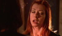
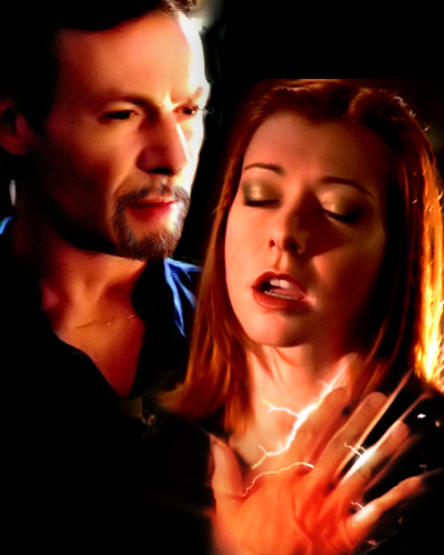
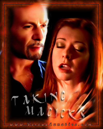
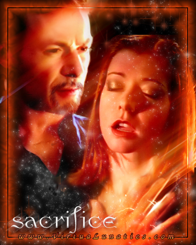
A cleaned up Ethan, Willow and hand are now cut and pasted together in a somewhat possible and probable position. If all is well, they should flow together fairly well and no one piece "stands out" too much.
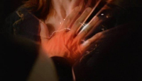
In this particular version, I added sparkage to intensify the hand "draining" the magicks.
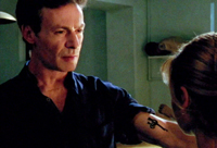
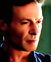
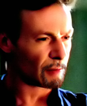
As in all episode posters including the dark sorcerer, Ethan needs particularly special attention. As I'm sure you all know, in the actual show Ethan has no beard. Just to make things interesting, and a challenge for yours truly, the Loonies voted to go for a more menacing, bearded Ethan after an inspirational manip Koala offered up. Thus was born dark Ethan.
If you haven't noticed, there is an overall "style" for all the VLC episode posters; the border and the site address are always included. I usually choose colors for both "signature" items from the graphic yet try to vary them from what's been used so far in previous episode posters. You'll notice I went for the "glowing" border to make it more magical... ooohhhhh!
All this time, I'm continually fiddling with filters and basically doing and undoing different settings to tweak things. Then, when I think my ego is ready, I send it off to the editor and chief, GF.
As is my usual...
I'm stumbling along at a slugs pace on Coven Attack so I decided to try and self motivate by doing up ideas for the episode poster. Name is just for filler at this point. Not hot about the font, need something weird. Tried using your suggestion on the Willow picture and also added the hand shot as well, maniped it in. I like the Ethan shot though it's just not right overall.
Anyway, if you get any ideas or find some good source pictures, send them on over.
WF
Once again, VERY cool! Maybe Taking Magicks? The Ethan isn't bad....but he's not angry enough, maybe. Perhaps if you add some distortion to both of them, like they're melting/swirling/something? Maybe that would bring them both into play? Or can you make his forehead more wrinkly, like he's frowning? Try shrinking the hand about 10-15%, it looks a bit distorted, though the flash and flame look is good... the colors are great, sharp contrasts, looks nice.
Not sure, don't know of a better Ethan, an angrier one--other than that, it's super! There would be a better Ethan if we could hire Sachs, but based on what's out there, I think this is great--and as always, the beard manip blows me away! You know, this is almost an ep poster to release ahead of time, to get them going... I don't know about breaking the spoiler rule, but if there was one, this would be it....
GF
I'll try to "angry" him up. Thanks. The hand was iffy. I almost wanted to leave it out but it helped fill the space and explain Willow's expression. I'll fiddle with it as you suggested. The distortion might work, again, I'll doodle. As for releasing a episode poster early... I'm all for it but I'm a spoiler whore. To be honest, everyone knows Ethan will be back, I'd never give him up that easily. We have some serious spoiler people and this could be our one, huge spoiler and could really get rumors going rampant on the boards. Would be fun. We can ask the rest of the gang.
WF
After placing a test title on the graphic, I had to admit the hand was indeed off. Grumble, grumble! So I tried making it smaller and lessened the sparks so the title could stand out more. After all, titles are kinda important.
Notice the temporary title. Yep... most of the time, we haven't a clue what to name an episode until it's done.
Slight blur effect for dreaminess.
To "anger him up, there is a very, very subtle darkening of his temple. Compare closely with the previous one and you will see the difference... or maybe I'm just completely insane.
And hey... Ethan has scars now. Hmmm...
Just another version; me playing around. A motion blur that added distortion for a deeper, more menacing tone, but too dark.
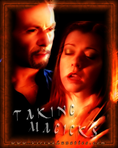
Bingo... the best balance. Motion blur faded to add a dreamy effect but not overpowering.
Now for the title and the font...
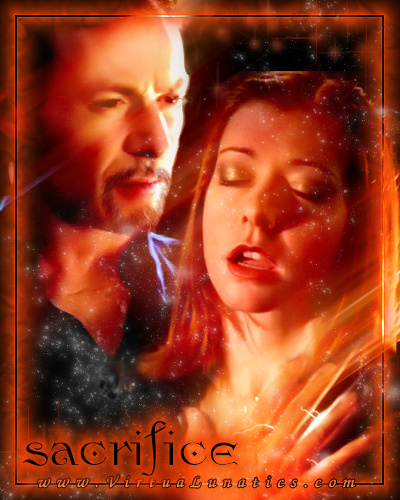
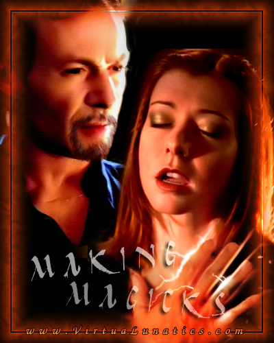
From the looks of it, Willow is indeed in trouble but is the title fitting? The graphic could be so suggestive and in so many different ways. Is she a willing participant or is Ethan taking magicks like the temporary title claims. After some discussion between GF and myself, we decide to make things more vague.
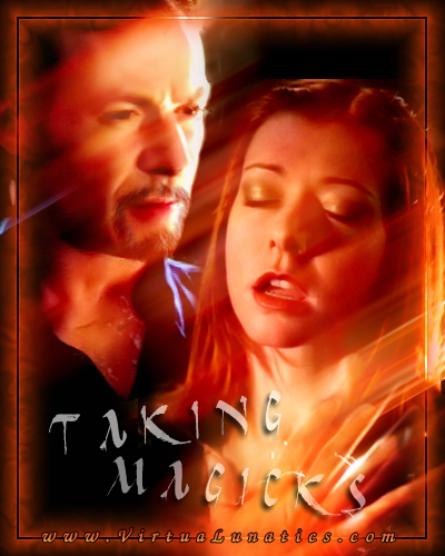
Thinned lips the best I could. I think this is the best title to get the idea across and I like the mystical font. Whatcha think?
WF
EXCELLENT LIP WORK! Damn, you really are amazing! Ethan looks fine now, no prob.... I think I'd go with Sacrifice (no ing) and the font is great! Maybe bold it? This is very nice!
GF
Alrighty, I'll change it to "Sacrifice" and then we can post it to the gang with the suggestion of the spoiler and see if there are any objections. We could also link to the pic on the boards or actually post it there if you wanna make it a "oh no... Wicked's shattered the spoiler rule." Or we could give a spoilery fan the chance to post the link, a spoiler spy type thing. If it's okay by the gang... how soon would you like to post it?
WF
I think it might be something like I post to the boards with a "sorry folks, she found Ethan's body, reanimated it, and insists on playing with him. And I had to feed her SOMEONE. Look out for WF's ep, airing on...." And then link to the pic so it comes as a pop up. Don't put it in the graphics section yet (or at least not advertised there), just have the link on the board. --and we do it as soon as we can....
What do you think?
GF
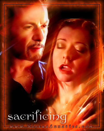
"Sacrifice"... nice and dramatic with no real obvious mention of who or what is the sacrifice.
So I post some possible choices again. Added pretty red and white sparklies to make more of a magical feel. Motion blurred our newly inspired title, "sacrifice".
Font choice is one of those difficult things to decide on as well as agree on. Everyone has their preferences. This particular font was only chosen after many, many, many other versions. GF and I usually chat over the choices and whittle down until we find just a few. Luckily, this one just seemed to fit.
So this one gets posted to the group for a veto or a nod...
This slightly hazy, lighter opacity "sacrifice" title also gets posted to the group for a veto or a nod...
And now I post to the Loonies for input and we suggest using the poster as a spoiler, asking if there are any objections.
The feedback commences...
Love the poster. A suggestion - which may or may not work - see what it looks like if you do "Sacrifice" in blood red then put a white glow around the letter to off set them from the background.
You might also try putting a highlight in Ethan's eye. That will make it appear even more like he's looking at Willow.
I think using the poster as a spoiler is a great idea. It should definitely stir up some interest.
Jessie
Jessie, did the eye twinkle and tried your suggestion with the font. Not sure about the red with white glow. I tried this alternative. Which do you prefer?
WF
I like the black text, myself. The twinkle in his left eye seems to bleed onto his lower eyelid and isn't in the same position as the one in his right eye.
That said, the position of the left-eye twinkle is right, based on the light source on his face, but the right-eye twinkle is off.
joy-joy
Tara
Yeah, the red is too difficult to read. I love the black across the light part of the poster. BTW, nice choice of font. Very Ethany!
Jessie
So.. to twinkle or not to twinkle. I can fiddle with it until it's right.
WF
Hmmm.... I think I vote no twinkle and black font.
And WF, save these would you--all variations and notes on why they are changed, plus the earlier ones about Making Magic and so on, from the start (I still have if you deleted them). This would be a good BTS feature, a creation of an ep poster, and how it was used to jump start you on the ep, and also how it was used, because it was created, to do a spoiler feature--it wasn't created for the spoiler, it generated the spoiler. The whole process on making a graphic, trying different ideas, different looks, different titles, all that--this is a good BTS, wouldn't you think? It could be written up with excerpts from emails and with all the many different variations tried....
And there you have it folks. The down and dirty on creating a episode poster and how it evolved into a spoiler.