|
|
|||
|
|
|||
|
We started with variations on a theme with slightly different effects. |
|||
|
|
||
|
|
||
|
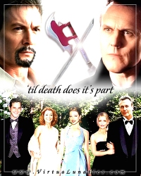
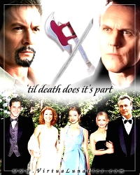
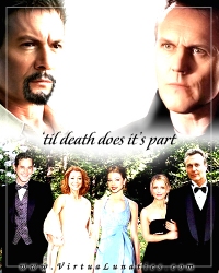
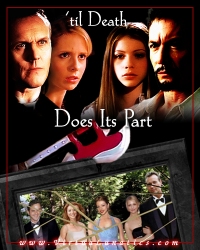
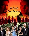
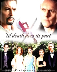
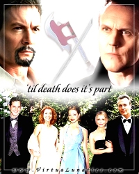
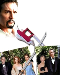
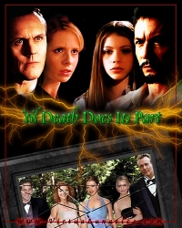
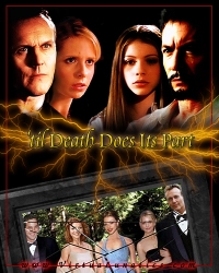
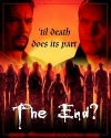
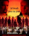
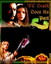
We liked the sword and scythe crossing blows, representing the different Slayers and their natures, and we liked pairing Giles and Ethan. And the title fit well with the prom picture. But all in all, the poster just didn't grab us. It was missing the power and energy we tried to put into the last episode. |
|||
|
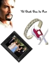
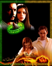
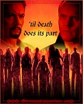
So we tried simplifying it in different ways, to see if more space would give each element more impact: |
|||
|
|
||
|
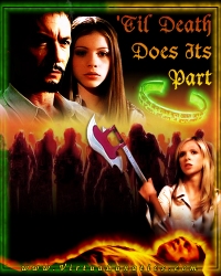
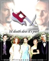
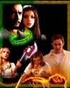
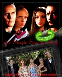
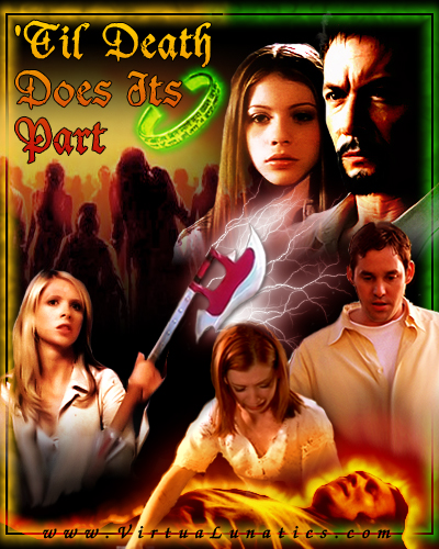
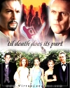
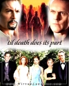
That still wasn't right. So we thought to go another way entirely, focus more on the episode events: |
|||
|
|
|
||
|
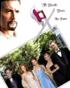
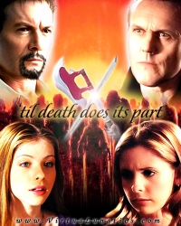
That was getting closer, but neither got in all the gang or all the events. We fiddled some more and then decided to take a break and move in yet another direction. We had all these different elements, so we began merging multiple images in different patterns: |
|||
|
|
||
 |
|
||
 |
 |
||
|
All appealed in one way or another...and looking at the
huge range, we knew then that we couldn't let all of them be deleted
forever as so many other poster variations have been in the
past. |
|||
|
|||
|
A final note: of course all of the above only represents a fraction of the test
posters. |
|||

|
|
|
|
|
 |
 |
|
 |
 |
 |
|
|
Not all posters took as long as this to make. Some
were done in virtually a single draft. But some
posters did take quite a bit of tweaking. We hope you agree
with all our final choices! |
|||
|
|
|||

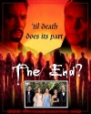
 We wanted that last poster to be JUST right.