|
|
|
It seemed to take forever sometimes, for us to get the
perfect poster, the one that was JUST right for the episode. Some
posters were done before the ep aired and some were made long after. |
|
|
The episodes As We Were and
What Lies Within were closely connected and written, in part, simultaneously.
The posters were also done together and went through a number of
changes. |
 |
 |
|
|
But we realized that the photo made a more dramatic poster, so WF started to fiddle with several backgrounds and fonts before picking the final version, which unlike the two drafts below, was actually used in the end for What Lies Within! |
|
 |
 |
|
The trio picture was then
edited and actually used for As We Were's final poster.
|
  |
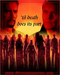
| Destiny's poster was reworked a dozen times, not just for the font, but the placement of the characters. In the first draft, Cordy and Snyder appeared. Later drafts pulled in Kendra and Percy. Different head shots were tried (see Spike) and we moved people around (see Maggie, Robin and Wes for example). There were about 20 different tweaks to Destiny's poster, including the question about using a question mark! |
|
 |
 |
|
Heart & Soul's poster had multiple variations. We tried different colors and backgrounds and fonts before hitting the one we liked. |
|
 |
 |
 |
 |
| Mind Games offered us some of the most difficult choices. Gabi worked up a variety of images and color variations, all of which appealed in different ways. Note the two bottom versions. The one we finally choose as our favorite has Ethan and Buffy blued out, and BG in red tones. It was a tough call. |
|
 |
 |
 |
 |
|
In some cases, we just had some very different choices to make. These weren't variations, they were completely different options. |
|
 |
 |
|
Sometimes, we knew what we wanted, and we simply experimented with positioning: |
|
 |
 |
 |
 |
|
And sometimes we just had fun:  |
|
|
|
|
|
Particularly when putting up potential spoilers for
the finale! |
|
And the final finale poster? Well, that job deserves a page unto itself! |
|
|
|
|
Hope you enjoyed seeing some of what you missed before. The posters here were created by WickedFox and Gabi, with creative input from all the Lunatics. Remember, this is only a small selection of the rejects. Some posters went through twenty or thirty small tweaks before they satisfied the artist or the Lunatics as a whole. |
|


